\"Wine,\" \"Burgundy,\" or \"Merlot\"? Making Vendor Color Names Make Sense
TL;DR
Every fall vendor names the same dark red something different, wine, burgundy, merlot, port, oxblood, so a shopper filtering your site for "burgundy" misses half the burgundy you carry. Pick one plain, shopper-friendly name for each color family and use it consistently across every brand, while keeping the vendor's original color name stored internally so receiving and reordering still line up with the invoice. Ohavah pulls each color straight off the supplier invoice when it builds your product list, so the vendor's exact wording is captured for you and standardizing the customer-facing name is a quick edit instead of a retype.
Turn supplier invoices into products instantly
Skip the manual data entry. Upload a PDF, get ready-to-import products.
Pull up your new fall arrivals and count how many names you're carrying for the same dark red. One brand calls it wine, another burgundy, a third merlot, and somewhere in there is a port, an oxblood, and a plain old "dark red." To you they're nearly the same color on the rack. To a shopper searching or filtering your site, they're six different things, and five of them are invisible when she looks for the one word she typed.
Color names are one of the few product details that come straight from the vendor and go straight onto your site untouched, which is exactly why they're such a mess. Every brand has its own romance-novel vocabulary for the season's palette, and when you carry a dozen brands you inherit a dozen naming systems. Cleaning that up is some of the highest-payoff listing work you can do before the fall and holiday rush, and it costs you nothing but a decision.
Why vendor color names work against you online
On the floor none of this matters. A customer sees the color, so it doesn't much care whether the tag says merlot or wine. Online, the name is the color, because it's what she reads, searches, and filters by.
That breaks in a few ways that cost you sales without ever looking like a problem:
- Search and filters fragment. A shopper who filters for "burgundy" sees only the pieces one brand happened to label burgundy, not the wine sweater and the merlot dress that would've completed her look. She thinks you have three options when you actually have nine.
- The palette looks random. Scroll a collection where every deep red has a different name and the store reads as disorganized, even though the merchandise is perfectly coordinated. Consistent naming makes a season look intentional.
- Cross-brand outfits get harder to sell. Half of building sets and layering that raise your average order is showing that the top and the cardigan go together. If one's "camel" and the other's "toffee," the shopper can't tell they match.
- Odd names confuse instead of charm. "Oatmeal," "greige," "ecru," and "sand" might all be the same soft neutral. A cute name is fine, but not at the cost of a shopper not knowing what color she's actually looking at.
Build a simple color dictionary
The fix is a short, plain-language list of the colors you actually carry, with every vendor's variant mapped to one of them. Keep it to the words a customer would use, not the words a design studio would.
A fall example might look like this:
| Your shopper-facing name | Vendor names it maps to |
|---|---|
| Burgundy | wine, merlot, port, oxblood, bordeaux |
| Rust | terracotta, brick, clay, spice, paprika |
| Olive | moss, fern, sage (deep), army |
| Camel | toffee, tan, fawn, biscuit |
| Cream | ivory, oatmeal, ecru, bone, off-white |
| Forest | pine, hunter, evergreen, deep green |
You don't need it to be perfect or exhaustive. You need one obvious word per family that a shopper would actually type, and a habit of mapping each new arrival to it as it comes in. Keep the list in a shared note so anyone building listings uses the same names, the same way you'd keep your tags and collections consistent instead of inventing new ones per product.
A couple of judgment calls worth making up front. Don't over-merge: if you actually stock a bright true red and a deep burgundy, those are two names, because collapsing them frustrates the shopper who wants the brighter one. And lean toward the plainest word in the family, since "burgundy" gets searched far more than "oxblood."
Keep the vendor's name, just not on the front
Here's the part that trips people up and stops them from standardizing at all: you still need the vendor's original color name. When a piece sells and you want to reorder, the rep knows it as "merlot," your invoice says "merlot," and if all you kept was your own word "burgundy" you're now playing a guessing game across a line sheet to figure out which style and color to reorder. The same goes for receiving, when you're checking a box against a packing slip that uses the vendor's words, not yours.
So the rule is two names, two jobs. The customer-facing color is your standardized word, the one on the product page that shoppers search and filter by. The vendor color is the original name, kept where your team can see it but the customer doesn't need to, so receiving and reordering stay tied to the invoice.
In Shopify there are a few clean places to keep that internal name. The simplest is the SKU or a tag: a tag like vendor-color:merlot never shows to the shopper but is fully searchable in your admin when you're reconciling a reorder. You can also keep it in a private metafield or work it into your SKU convention. However you do it, the point is that the vendor's word survives somewhere searchable so your back-office stays sane, even as the storefront gets clean. This is the same discipline behind structuring product variants well: the customer sees a tidy set of options while the underlying data stays precise.
Where the extra work actually goes
Standardizing color names sounds like one more thing to do to every product, and if you're retyping listings by hand, it is. The friction is real: by the time you've keyed a shipment's worth of line items into a spreadsheet, going back to normalize every color name is the task that gets skipped, which is how the six-names-for-one-red problem builds up in the first place.
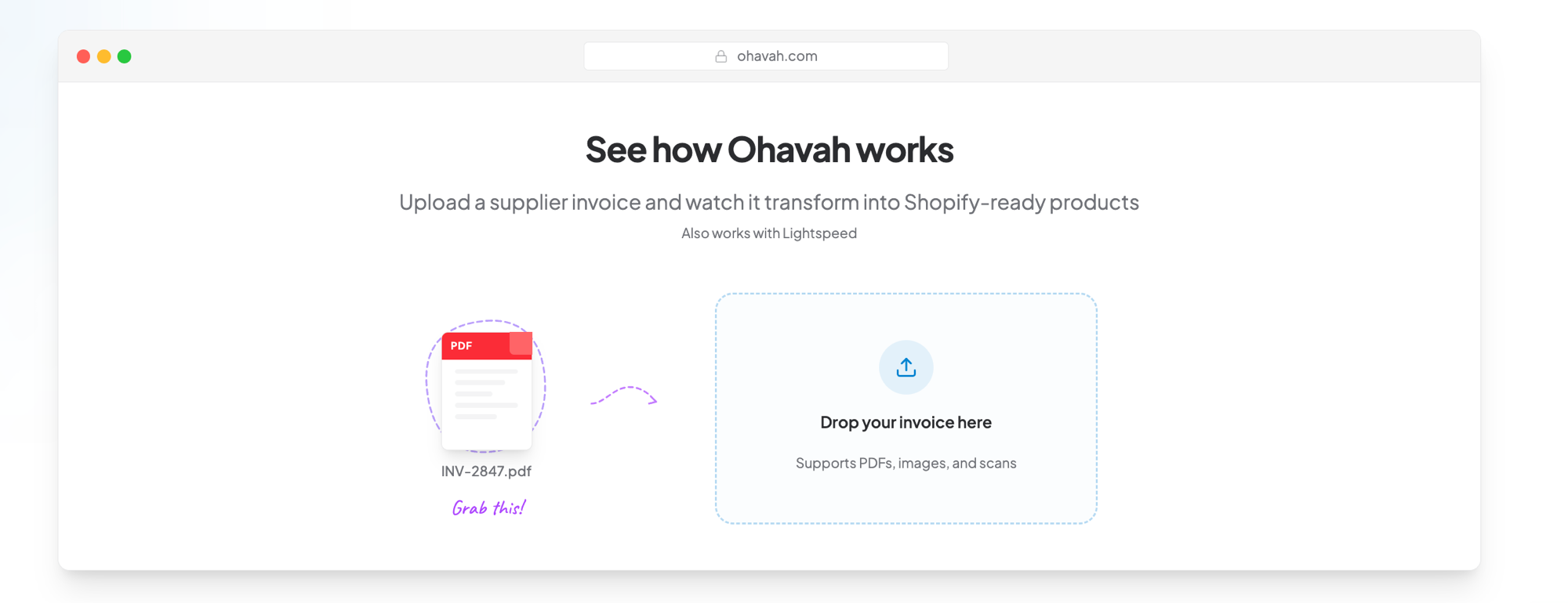
It gets much easier when the vendor's color is captured for you instead of typed by you. When you turn a supplier invoice into products with Ohavah, it reads each line item off the invoice, color included, and builds your Shopify-ready product list in minutes. The vendor's exact color name lands in the data automatically, so you're never retyping "merlot," you're just deciding it should show to customers as "burgundy" and moving on. Setting the customer-facing name becomes a quick edit on top of a list that's already built, not a from-scratch typing job.
If you already export or build your listings through a product CSV, a color dictionary is even easier to apply, because you can standardize a whole column at once instead of clicking through products one at a time. Either way, the goal is the same: the vendor's word captured for your back office, your word shown to the shopper.
Boutique owners who've moved off manual entry talk about it in their own words on our customer stories. Here's Lacy from Willowmere Boutique:
Do it once, before the season builds up
Set the color dictionary now, while the fall floor is still filling in, and every arrival after this maps to a name you've already chosen. Wait until you've got three hundred products live under a dozen vendor vocabularies and you're looking at a cleanup project instead of a habit.
Clean, consistent color names are a small thing that makes a store feel put-together and makes every filter and search actually work, and pairing them with the fit details from what your best sales associate knows that your website doesn't is how your product pages start doing the selling your floor does. Pick your words, keep the vendor's underneath, and let the shopper find the burgundy she came for, all of it.
Try Ohavah free for 7 days and turn your supplier invoices into ready-to-list products in minutes, with each vendor's color captured for you so standardizing the customer-facing name is the easy part.